GEOGRAPHY PRACTICALS 12th
What is Map
It refers to an image of an area, commonly of the earth or part of the earth. Furthermore, a map is different from n aerial photograph because it includes clarification. Moreover, the word map can also be used to talk about a chart or drawing that shows relationships between ideas, events, people, etc.mainly, there are two types of maps political maps and physical maps. However, over time both of these maps change because many forests were cut down to build roads and houses, towns expand and borders change. However, most maps include a compass rose that indicates the four directions gnerally, we use maps as a reference to show political boundaries, landforms, water bodies, and the positions of cities. Maps also help us to know the routes of an area, landmarks, location (latitudes and longitudes) of a building or things, etc.

Types of Map
Maps are of several types. They are mainly classified into:
- Physical or Relief Maps: These show natural features of the earth.
- Political Maps: These maps show the cities, town and villages, countries and states of the world with their boundaries.
- Thematic Maps: These maps focus on specific information like the map of a rainfall, roads, tourist places.
Components of Maps
Maps have three components: distance, direction, and symbol. We measure distance in terms of scale. A scale is a ratio between the actual distance on the ground and the distance shown on the map.
- To measure large areas like continents or countries on a paper, we use a small scale map.
- To show a small area like your village to town on a paper, we use a large scale map.
Directions are cardinal points like North, South, East and West. And symbols are certain letters, shades, colours, pictures and lines, which give us information about a limited place. Various other things like sketches and plans are used to draw an area of a large scale.
Map Driections

Directions are indicated on the maps by the North-South line, with the arrow head pointing towards the North. If the north-south line with the arrow is not drawn on the map, then the top of the map is taken as the north and the bottom of the map as the south; the right is the east and the left is the west direction.
Directions are measured from the North-South line, North-East (NE). South-East (SE), South-West (SW) and North-West (NW), are the cardinal directions between the four major directions. For example, A is located north-east of O and B is located to the south east of O. For w precise measurement of direction, measure the angular distances of A and B from O with the North-South line as the base. Join OA and OB and if the angle is of 50°, it will be expressed as North 50° east. If the angular measurement of B is 40°, it will be expressed S south 40° east.
MAP SCALE
Large Scale Maps(i) Large scale maps show a small area in greater detail.
(ii) They are guide maps or topographic maps.(iii) Details of cities, towns, villages are shown.(iv) The scale may be 1 cm = 50 m or 1 km.Small Scale Maps
(i) Small scale maps show a larger area in less detail.
(ii) They are wall maps, or atlas maps.(iii) They show important features like mountains, plateaus, continents and countries.(iv) Scale may be 1 cm = 100
Liner Scale

geography, a linear scale is a bar or line graphic that shows the distance on the map that is equal to a real-world distance, such as 100 miles. Linear scales are also called bar scales or graphical scales.
Linear scales have a distinct advantage over other map scales because they are printed on the map, and the proportions stay the same if the map is enlarged or reduced during reproduction. To use a linear scale, measure the distance on the map that you want to convert. Then, place the measuring stick on the linear scale, and use the provided information to convert the map distance to a real-world distance.
2 Interpretation of Weather Map
The weather map is a symbolic representation of the atmospheric conditions of an area at a given time. On a weather map, you will find isobars and symbols related to pressure, direction and velocity of winds, clouds, precipitation and sea condition on a base map with political boundaries. These details are recorded at different weather stations at specified time.
Meteorological Departments forecast weather conditions by evaluating these weather elements shown on a weather map. This weather map is used in predicting weather conditions for a day, a week or a month in advance, which helps in taking precautions and safety measures. Weather forecasts help farmers, fishermen and crew of ships. It also helps air flights in predicting atmospheric condition a few hours ahead.
Weather maps are the collection of weather information from various meteorological stations pertaining to the
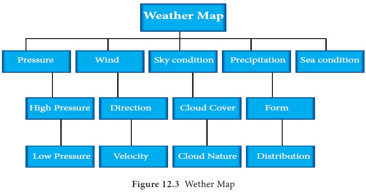
The weather charts are prepared daily based on weather observations collected by the Indian Meteorological Department (IMD). The basic knowledge of weather elements is needed to interpret the weather maps. The essential weather elements to interpret the given weather maps are:
Schematic representation of weather map elements
 STALISTICAL DIAGRAMS
1. Statistics : Meaning, Scope and Limitations
Concepts
Functions of Statistics
Limitations
Misuses
2. Collection of Data
3. Classification and Seriation of Data
Objectives and Characteristics of Classification
Types of Classification
Variables and Frequency Distribution
Worked Examples
4. Presentation of Data : Tabulation
Meaning and Objectives
Parts of a Table
Specimen of a Table
Rules of Tabulation
Types of Tabulation
Worked Examples
5. Presentation of Data : Diagrams
Introduction
General Rules of Construction
Types of Diagrams
Worked Examples
6. Presentation of Data : Graphs
Fundamentals
Graphs of Time Series or Historigrams
Graphs of Frequency Distribution
Basic Types of Frequency Curves
Advantages of Graphs
Limitations
The Misuse of Graphs
Worked Examples
7. Statistical Analysis and Interpretation
Ratios and Percentages
Measures of Central Tendency
Dispersion
Probability
Index Numbers
Correlation
Regression
Analysis of Time Series
Interpolation and Extrapolation
.......................
PIE DIGRAM

India is a linguistically diverse country. According to the report of Grierson and the Linguistic Survey of India (1903–1928), there were 179 languages and about 544 dialects in the country. In modern India, there are about 22 scheduled languages and many non-scheduled languages. The largest part of the Indian population speaks the Hindi language.
Modern Indian languages can be classified into four major linguistic groups or language families:
- Indo-European or Aryan language family (73%)
- Dravidian language family (20%)
- Austric (Nishada) language family (1.38%)
- Sino-Tibetan (Kirata) language family (0.38%) ......................................
Line Graph

A line graph is a unique graph which is commonly used in statistics. It represents the change in a quantity with respect to another quantity. For example, the price of different flavours of chocolates varies, which we can represent with the help of this graph. This variation is usually plotted in a two-dimensional XY plane. If the relation including any two measures can be expressed utilizing a straight line in a graph, then such graphs are called linear graphs. Thus, the line graph is also called a linear graph. Here, we are going to discuss what a line graph is, its types, procedure to draw a line graph, and examples in detail. line graph or line chart or line plot is a graph that utilizes points and lines to represent change over time. It is a chart that shows a line joining several points or a line that shows the relation between the points. The graph represents quantitative data between two changing variables with a line or curve that joins a series of successive data points. Linear graphs compare these two variables in a vertical axis and a horizontal axis.
geography, a linear scale is a bar or line graphic that shows the distance on the map that is equal to a real-world distance, such as 100 miles. Linear scales are also called bar scales or graphical scales.
Linear scales have a distinct advantage over other map scales because they are printed on the map, and the proportions stay the same if the map is enlarged or reduced during reproduction. To use a linear scale, measure the distance on the map that you want to convert. Then, place the measuring stick on the linear scale, and use the provided information to convert the map distance to a real-world distance.
2 Interpretation of Weather Map
The weather map is a symbolic representation of the atmospheric conditions of an area at a given time. On a weather map, you will find isobars and symbols related to pressure, direction and velocity of winds, clouds, precipitation and sea condition on a base map with political boundaries. These details are recorded at different weather stations at specified time.
Meteorological Departments forecast weather conditions by evaluating these weather elements shown on a weather map. This weather map is used in predicting weather conditions for a day, a week or a month in advance, which helps in taking precautions and safety measures. Weather forecasts help farmers, fishermen and crew of ships. It also helps air flights in predicting atmospheric condition a few hours ahead.
Weather maps are the collection of weather information from various meteorological stations pertaining to the
The weather charts are prepared daily based on weather observations collected by the Indian Meteorological Department (IMD). The basic knowledge of weather elements is needed to interpret the weather maps. The essential weather elements to interpret the given weather maps are:
Schematic representation of weather map elements
1. Statistics : Meaning, Scope and Limitations
Concepts
Functions of Statistics
Limitations
Misuses
2. Collection of Data
3. Classification and Seriation of Data
Objectives and Characteristics of Classification
Types of Classification
Variables and Frequency Distribution
Worked Examples
4. Presentation of Data : Tabulation
Meaning and Objectives
Parts of a Table
Specimen of a Table
Rules of Tabulation
Types of Tabulation
Worked Examples
5. Presentation of Data : Diagrams
Introduction
General Rules of Construction
Types of Diagrams
Worked Examples
6. Presentation of Data : Graphs
Fundamentals
Graphs of Time Series or Historigrams
Graphs of Frequency Distribution
Basic Types of Frequency Curves
Advantages of Graphs
Limitations
The Misuse of Graphs
Worked Examples
7. Statistical Analysis and Interpretation
Ratios and Percentages
Measures of Central Tendency
Dispersion
Probability
Index Numbers
Correlation
Regression
Analysis of Time Series
Interpolation and Extrapolation
.......................
PIE DIGRAM
India is a linguistically diverse country. According to the report of Grierson and the Linguistic Survey of India (1903–1928), there were 179 languages and about 544 dialects in the country. In modern India, there are about 22 scheduled languages and many non-scheduled languages. The largest part of the Indian population speaks the Hindi language.
Modern Indian languages can be classified into four major linguistic groups or language families:
- Indo-European or Aryan language family (73%)
- Dravidian language family (20%)
- Austric (Nishada) language family (1.38%)
- Sino-Tibetan (Kirata) language family (0.38%) ......................................
A line graph is a unique graph which is commonly used in statistics. It represents the change in a quantity with respect to another quantity. For example, the price of different flavours of chocolates varies, which we can represent with the help of this graph. This variation is usually plotted in a two-dimensional XY plane. If the relation including any two measures can be expressed utilizing a straight line in a graph, then such graphs are called linear graphs. Thus, the line graph is also called a linear graph. Here, we are going to discuss what a line graph is, its types, procedure to draw a line graph, and examples in detail. line graph or line chart or line plot is a graph that utilizes points and lines to represent change over time. It is a chart that shows a line joining several points or a line that shows the relation between the points. The graph represents quantitative data between two changing variables with a line or curve that joins a series of successive data points. Linear graphs compare these two variables in a vertical axis and a horizontal axis.


Comments
Post a Comment